Forefront Power
About This Project
Branding was an important factor in the continued success of the Forefront Power. Founded in 2016 as commercial and industrial solar developer, Forefront Power had big shoes to fill as a spin-off entity of former renewable energy giant, SunEdison.
Branding
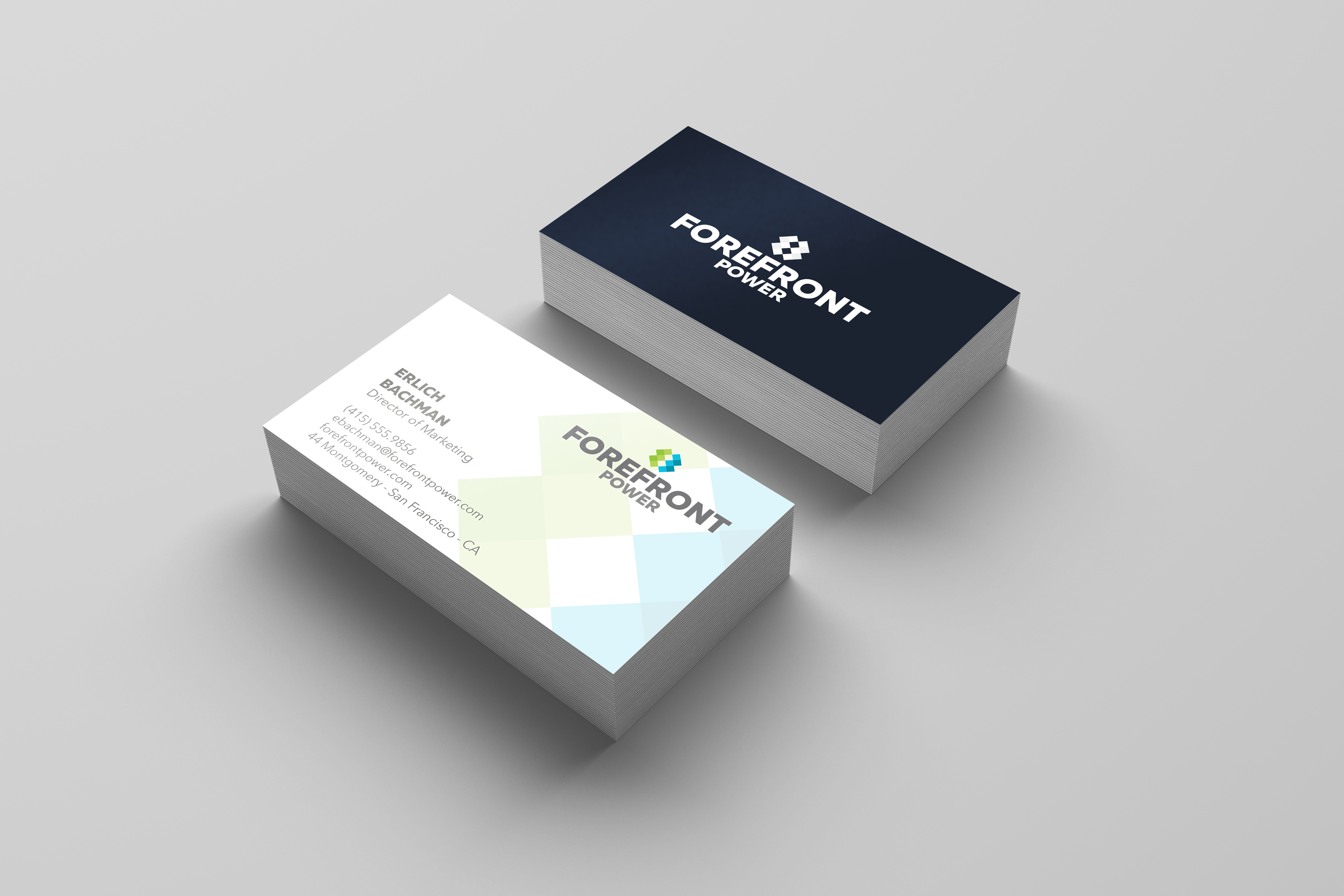
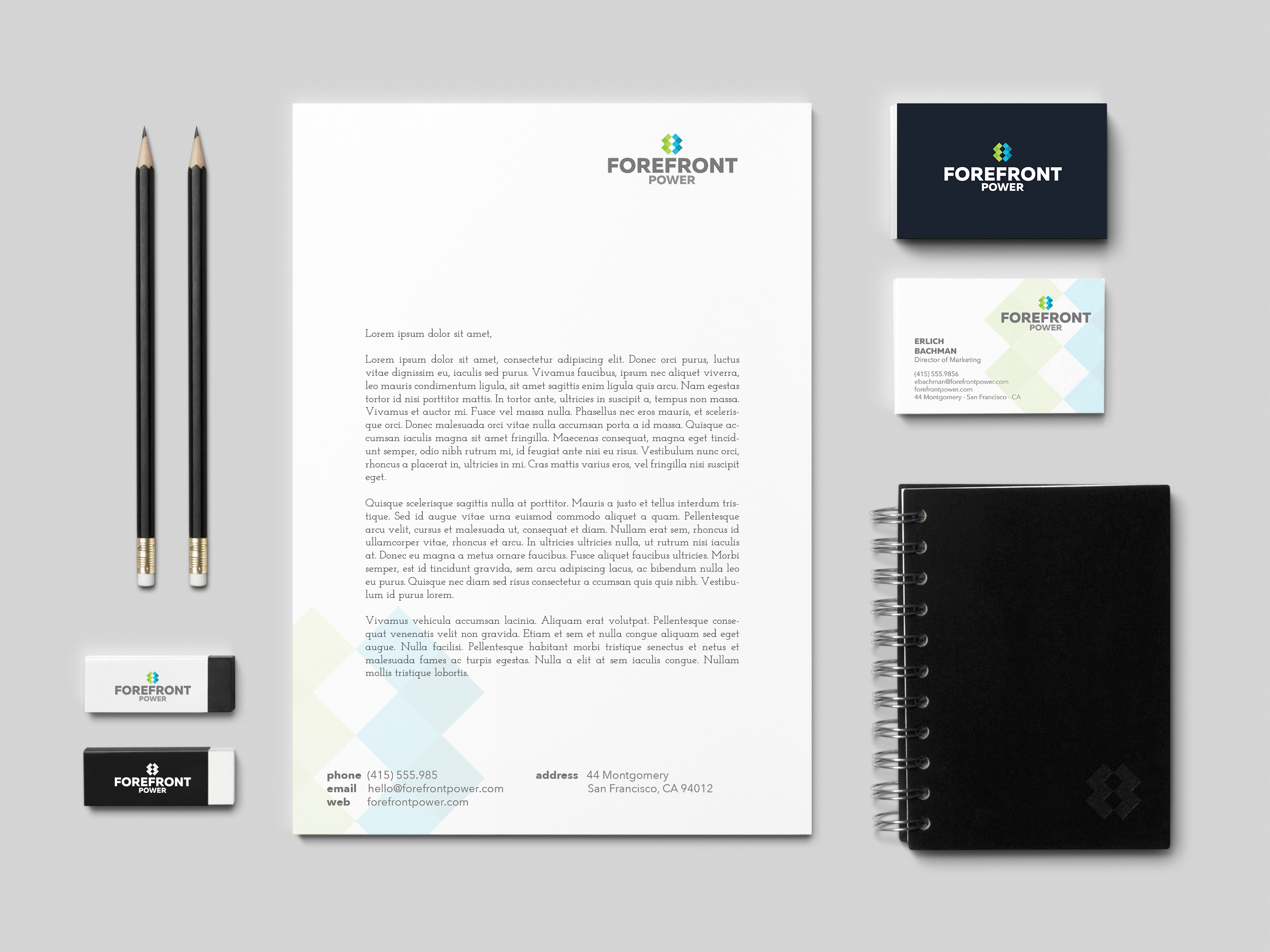
Forefront needed to cater to a variety of audiences such as, business customers, institutional investors, municipal governments, environmental groups and the public perception. The brand needed to be powerful and have meaning, while maintaining ties to what the company does. The leaders at Boldface crafted a flat geometric logo which took it’s inspiration from the modular design of solar panels. The green and blue colors are a nod to the earth and the environment that Forefront strives so hard to protect. The logo can also be used as a standalone icon and works well with a variety of applications like digital content and printed collateral.
For more information about Forefront Power, click here.


